A new way to meet new people
- ClientClssfd, Inc
- Year2021
- Disciplineweb, interaction, appstore

Build meaningful relationships naturally
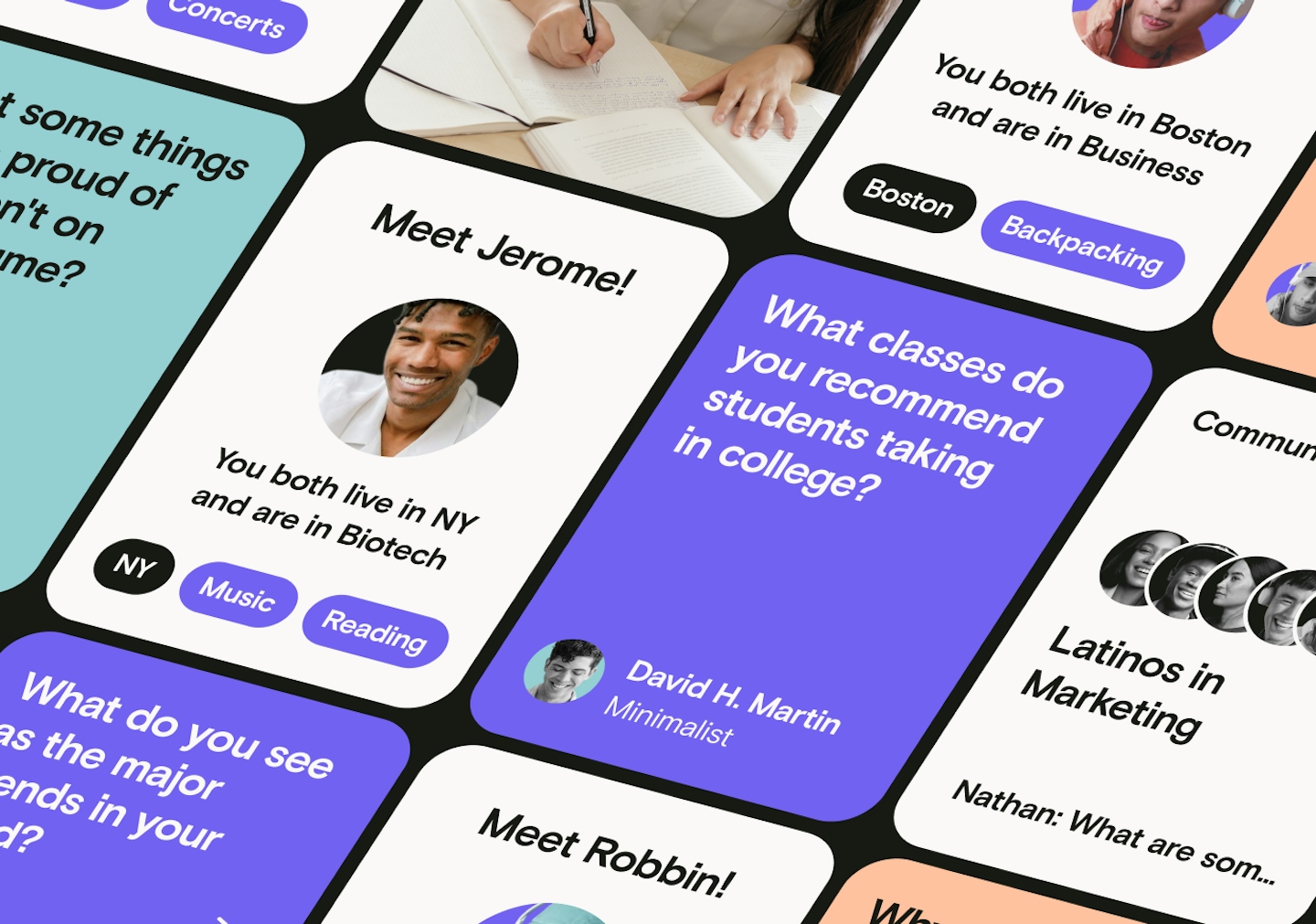
Clssfd is a startup with a unique vision to create a social platform that makes the process of meeting new people easier, more natural, and less intimidating. Whether you’re looking for a mentor, job, roommate, or just a friend with the same interest, Clssfd connects you to them so you can skip all the awkward introductions from the get-go. Goodbye A/S/L pls!

"
As an early stage social media startup, the expectations and stakes are high with any project. We simply needed a quality website which told the complex story of our brand, product, and company in order to survive and grow as a business.
.
/ Minnie Song + Kalyan Kanakamedala Founders
All the different ways to connect in one app
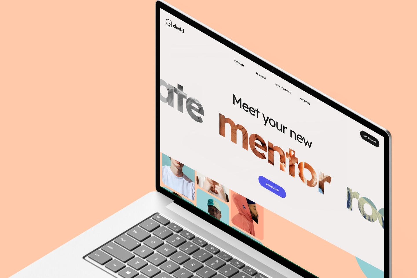
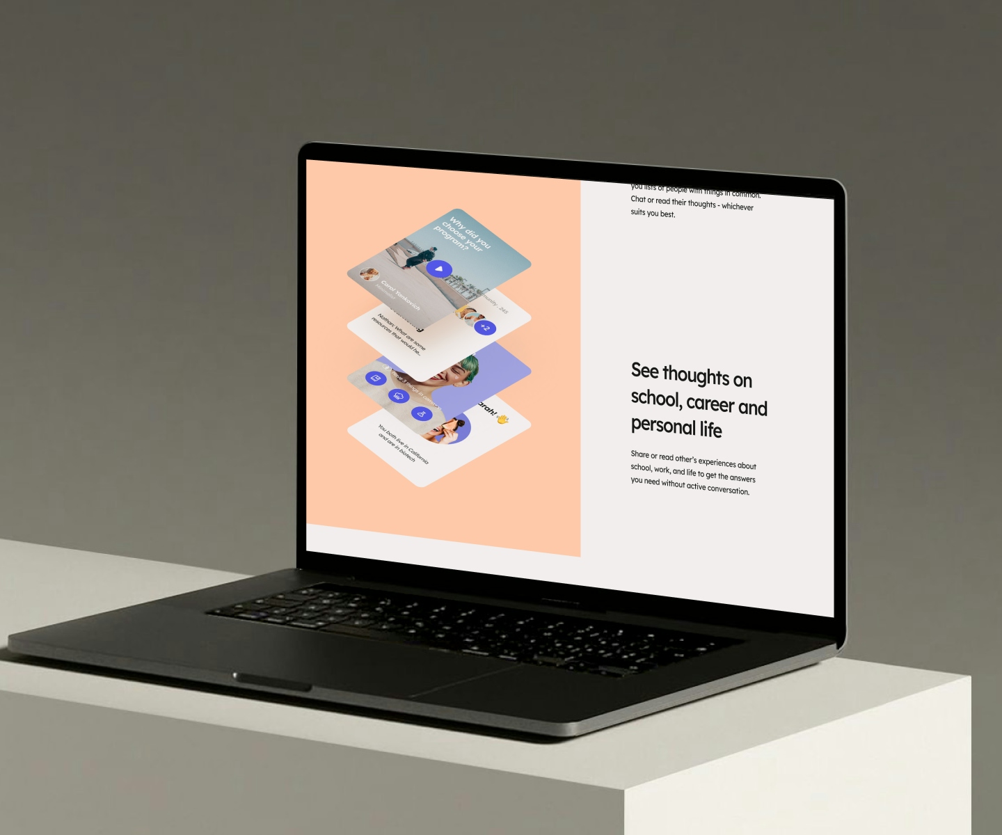
When Minnie and Kalyan came to us, they felt like their previous landing page didn't fully encapsulate what they offered. Because Clssfd includes a large spectrum of use cases and possible interactions, it was a challenge to articulate everything in a single page. They are the epicentre for creating connections - multiple connections, even. You could find a friend and a job; you could find a date, a mentor, and form a new band - the possibilities are endless! So, how do we clearly explain this while still being inclusive to everyone?

.
.
Amp up the Gen Z vibes
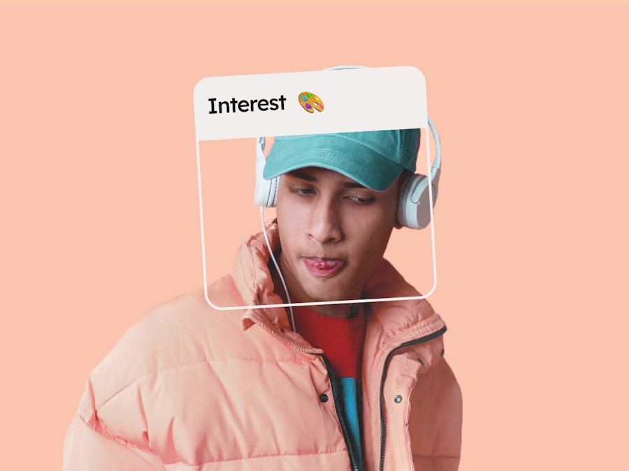
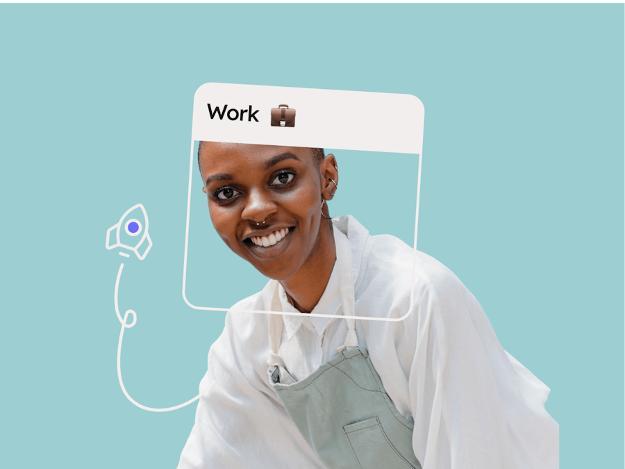
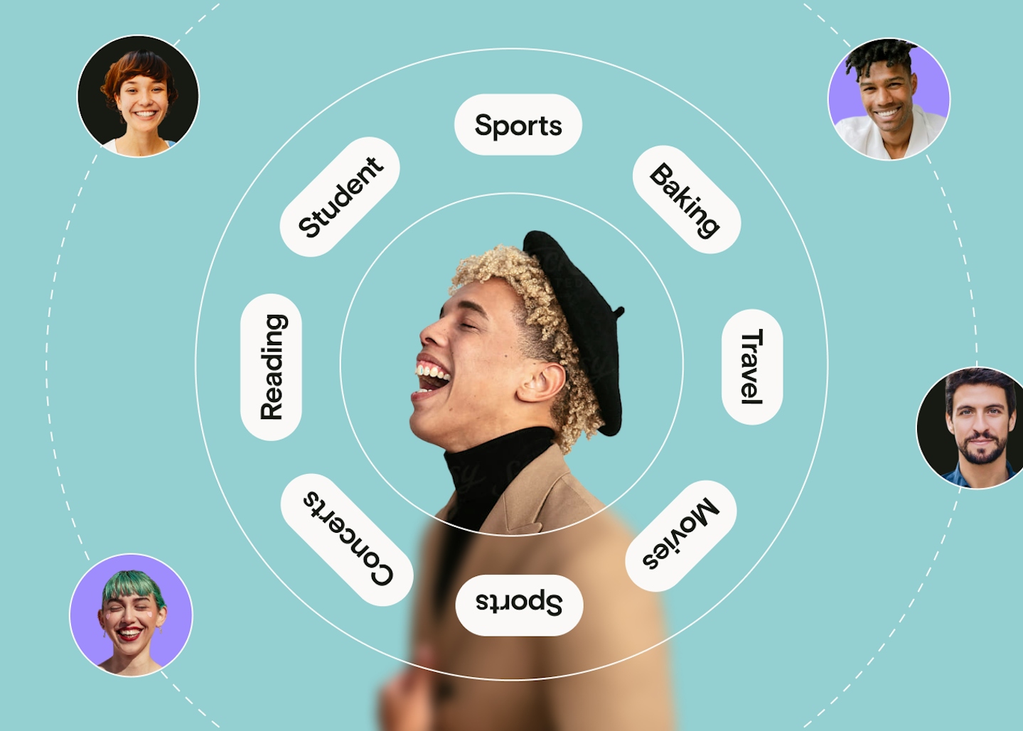
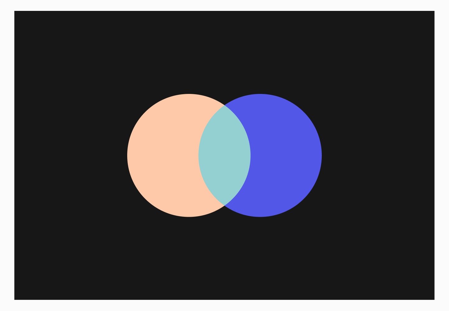
We wanted to channel a vibrant and exuberant energy in the colour palette. It had to feel young. It had to feel fresh. And it had to feel modern. Based on the existing indigo blue, we developed the colour palette to include salmon and teal to add a little fun spin to the overall look and feel. Circles and Venn diagrams are a big part of the visual identity as well. And for a good reason. It symbolizes overlapping connections, wholeness, totality, and unity - a subtle cue to illustrate community and togetherness.
.
.

.
Off the screen and into the marketplace
To prepare for their launch, we created a series of app store screenshots to clearly convey the message and idea of who they are and what they do in 8 frames. It was particularly challenging because the space was limited. We took advantage of great imagery, emojis, symbols, and doodles to say the things we can't with words. We dotted these elements to help us imply a message so space is saved yet message is not lost.

"
Tofu heard us at every step and exceeded our expectations by delivering a stunningly creative design which captured our vision completely and took it to the next level. They are not like any other design agency because your business comes first. We look forward to working with Tofu as a long term design partner.
.
/ Minnie Song + Kalyan Kanakamedala Founders
