Seafood, improved
- Year2019 — 2020
- DisciplineBrand Identity, Logo Design
- SectorHospitality / Food & Beverage


Fresh look for fresher seafood
Fresh seafood is synonymous with luxury but rarely has it been packaged according to its value. We thought that was intriguing and wanted to explore our interpretation of what a seafood market + restaurant hybrid might look and feel like. Thus, Kaisen was born.


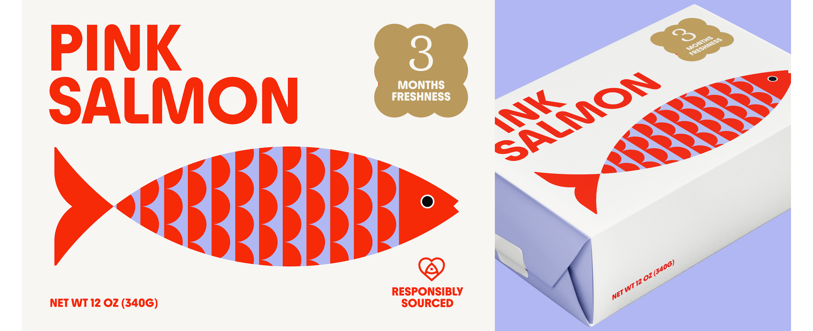

We named this project Kaisen for a few reasons: kaisen (海鮮) is Japanese for seafood which coincidentally sounds similar to kaizen (改善) which means "improved" or "change for the better"; we admire Japan's dedication to seafood; and we love the depiction of the sea in traditional Japanese art. The brand identity and research stemmed from there 3 key reasons - a foundation for how we approached the design and aesthetics. Ultimately, it's about finding ways to interpret seafood through modern design.
.


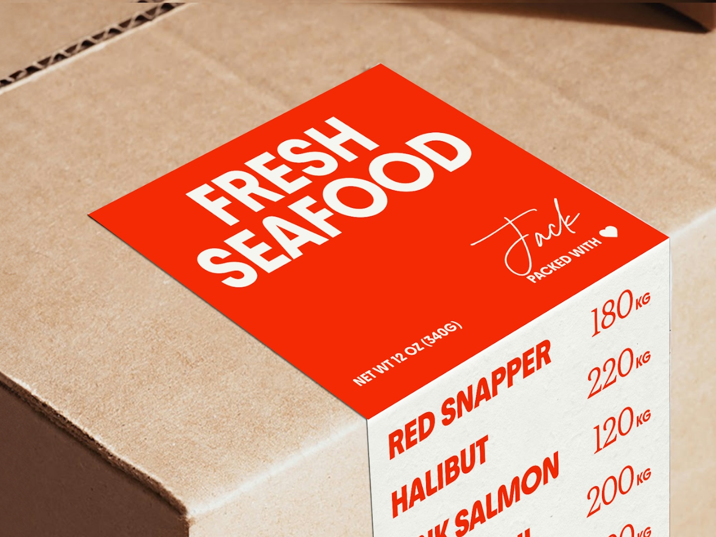
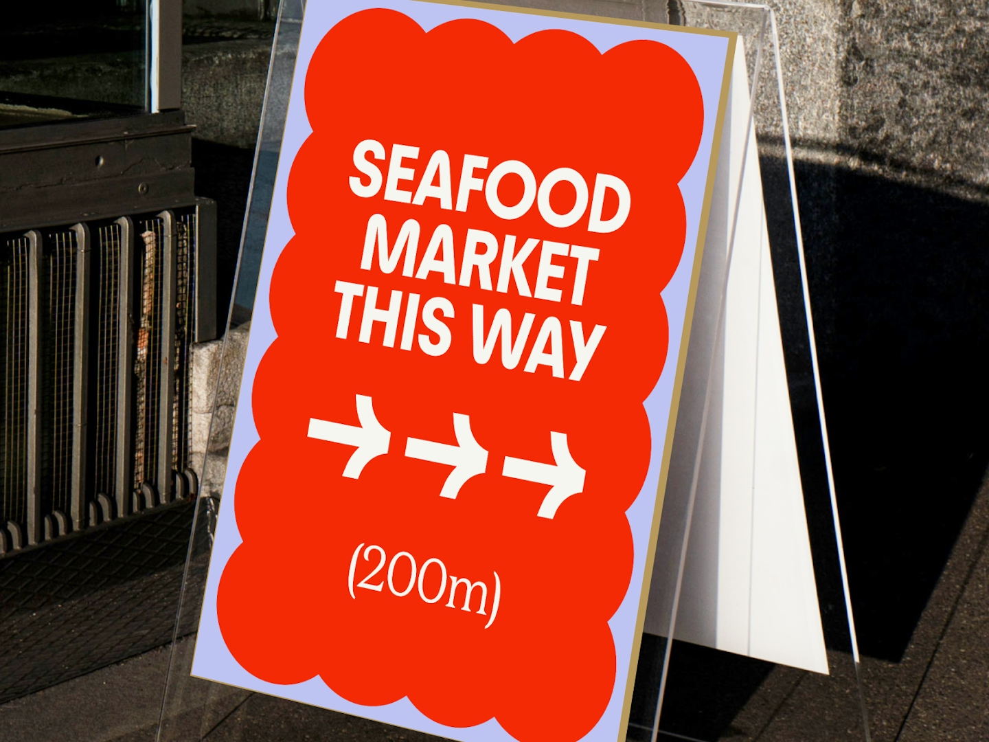
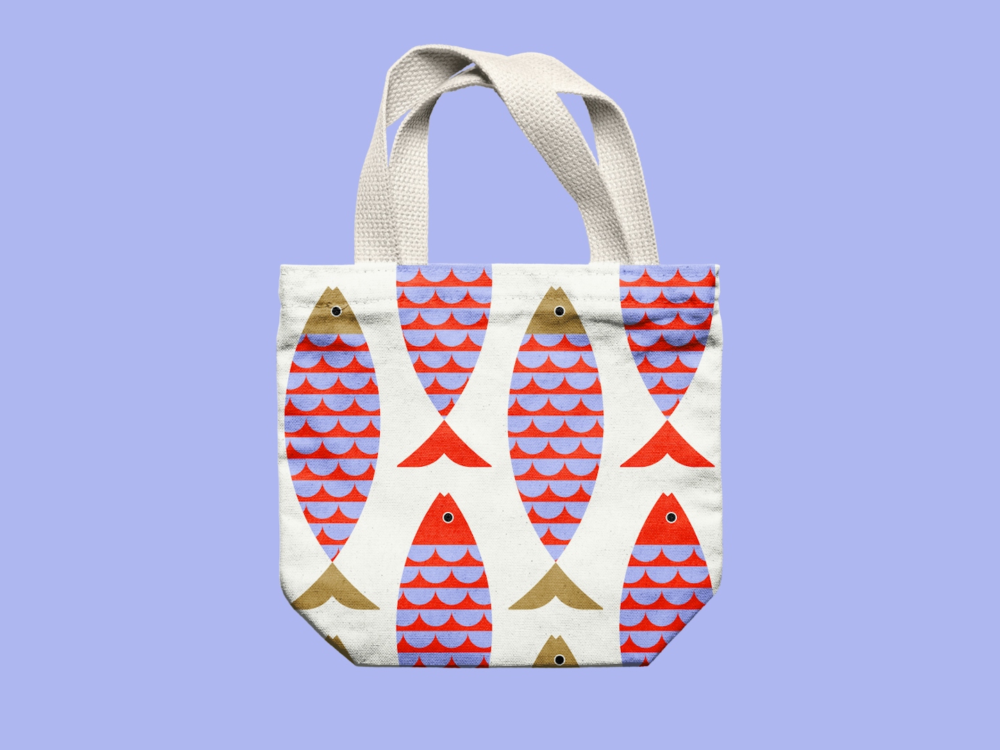


Kaisen's look & feel is heavily influenced by the ocean, rooted in Japanese art. The wave motif is inspired by the seigaiha - layered circles to represent good luck - a primary pattern you'll see all around the Kaisen brand. The colours represent the iconic views of a seafood market - carnelian red for the shellfish, purple for the octopuses and squids, and earthy browns for the wooden pallets.
.


