Make cleaning exciting again
- Year2019 - 2020
- Disciplineweb, interaction
- Asset CreditsMethod

Understanding the brand and running with it
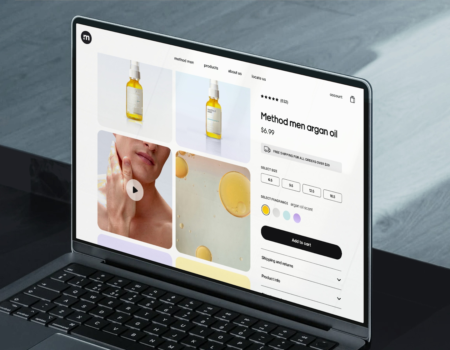
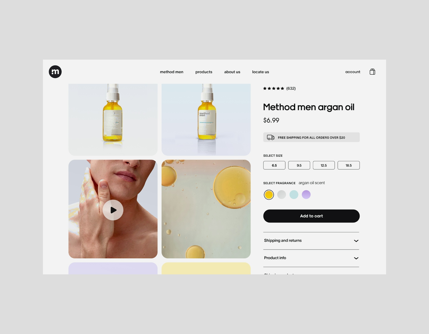
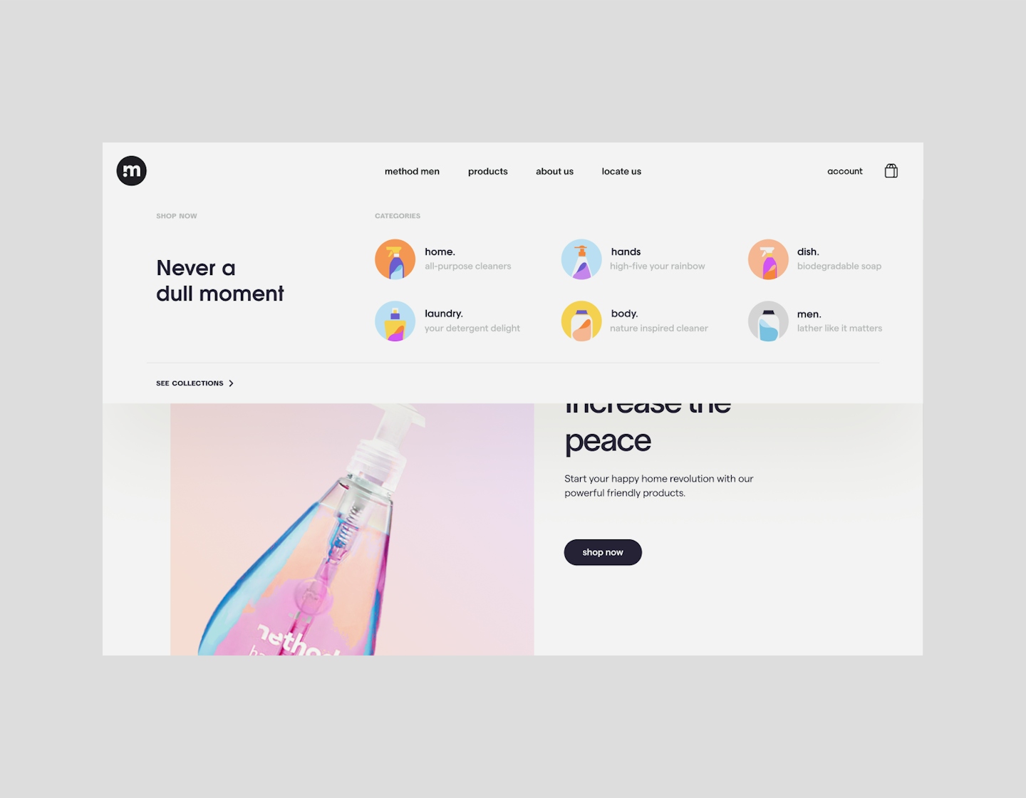
Method, as we know it, is an ultra colourful brand with a meaningful mission. Their products live up to the hype and their promises - one of the main reasons why we are loyal fans of the brand. However, we noticed they didn't have a central eCommerce site. Amidst the surge of online shoppers, we felt it was an amazing opportunity for us to answer the big question: what would their eCommerce site look like if they had one?

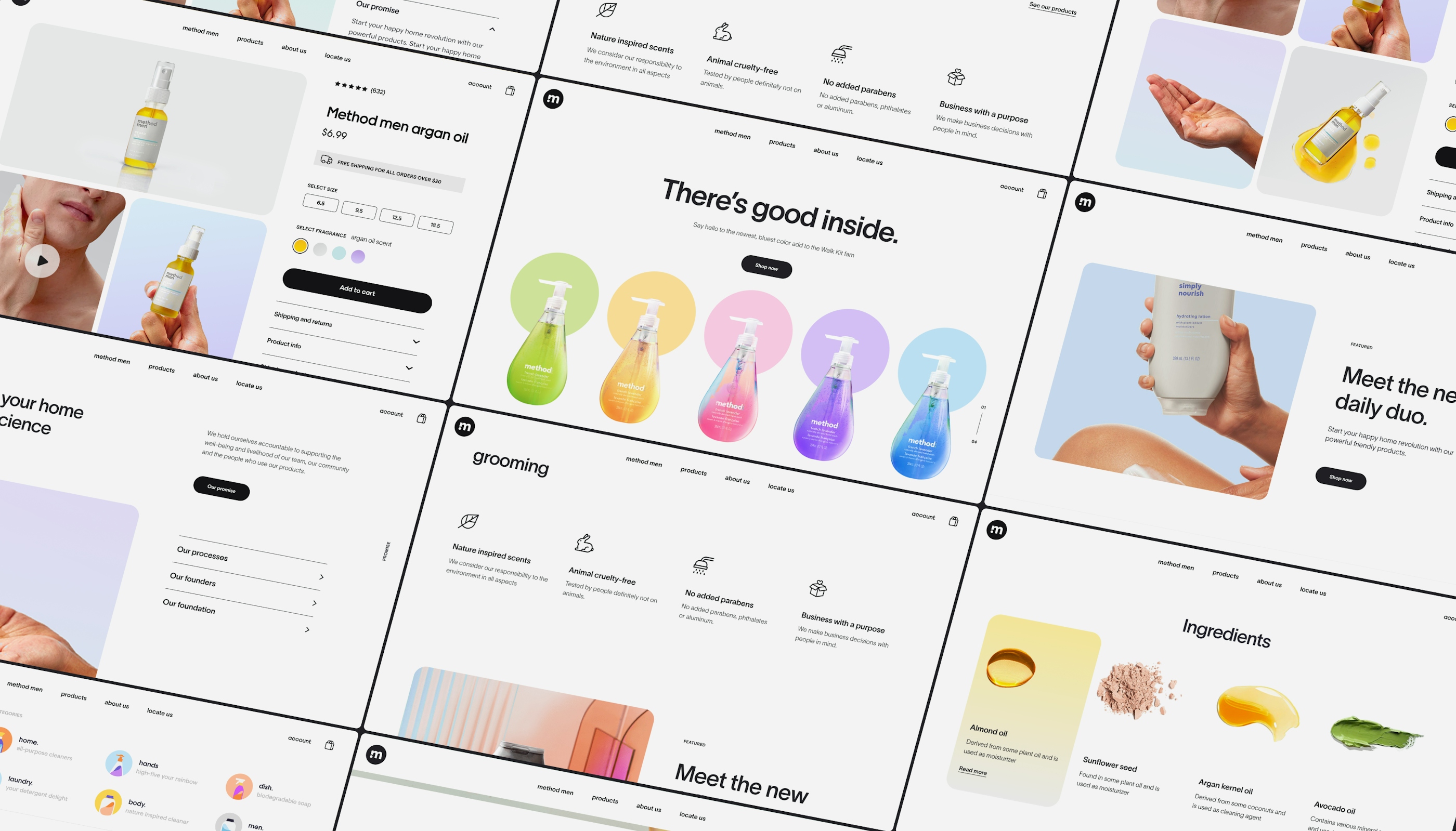
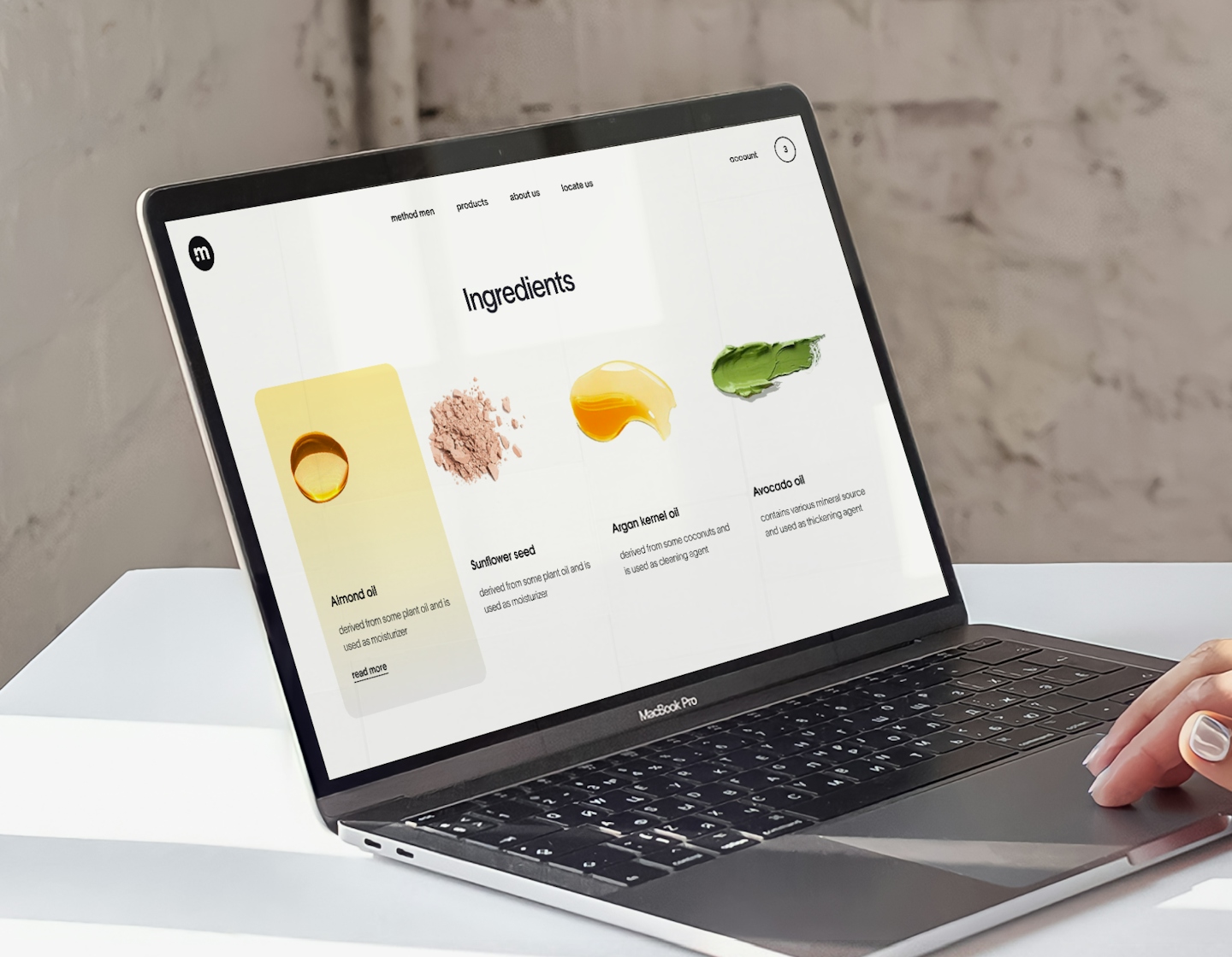
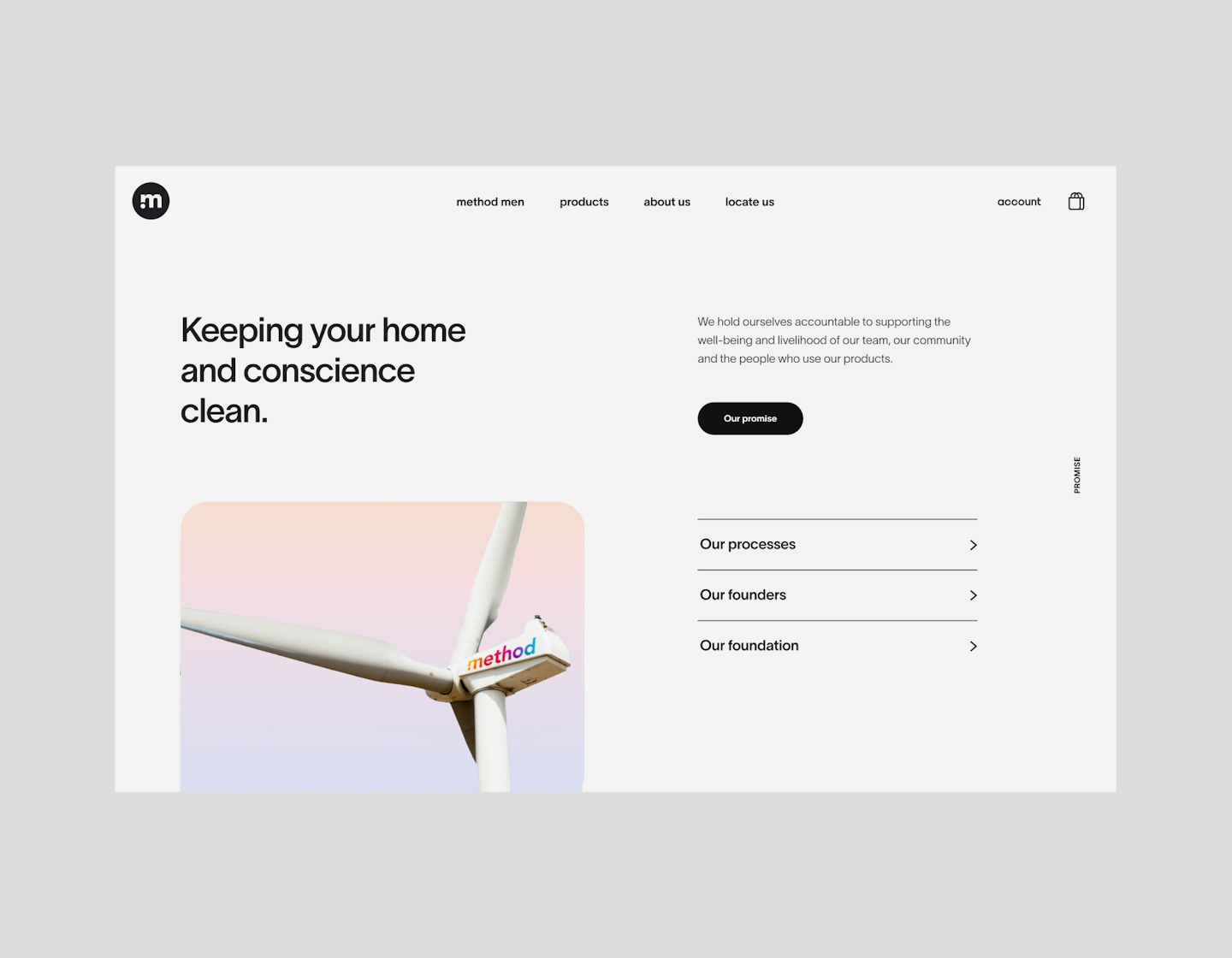
It's clean. It's fresh. And it's fun.
You know that "Ahh.." feeling you get after a spritz of Method's products? We wanted to bring that same feeling into the site - like a clean room with sparkly tiles that smells like zingy bergamot and lime, decorated with Method products.
.
.
.
Harmony in colours
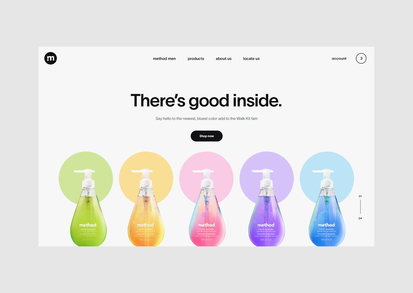
Taking note of Method's kaleidoscopic range of products, we put together a more subdued scheme to allow those products to shine. We used their alleged primary colour, a bright indigo, to expand on the scheme - creating a set of colours that embody Method without taking anything away.
.
.
.


