New kid on the airwaves
- Year2022 — 2023
- Disciplinebrand identity, website
- SectorMedia / Entertainment


Punchy and feisty, telling like it is
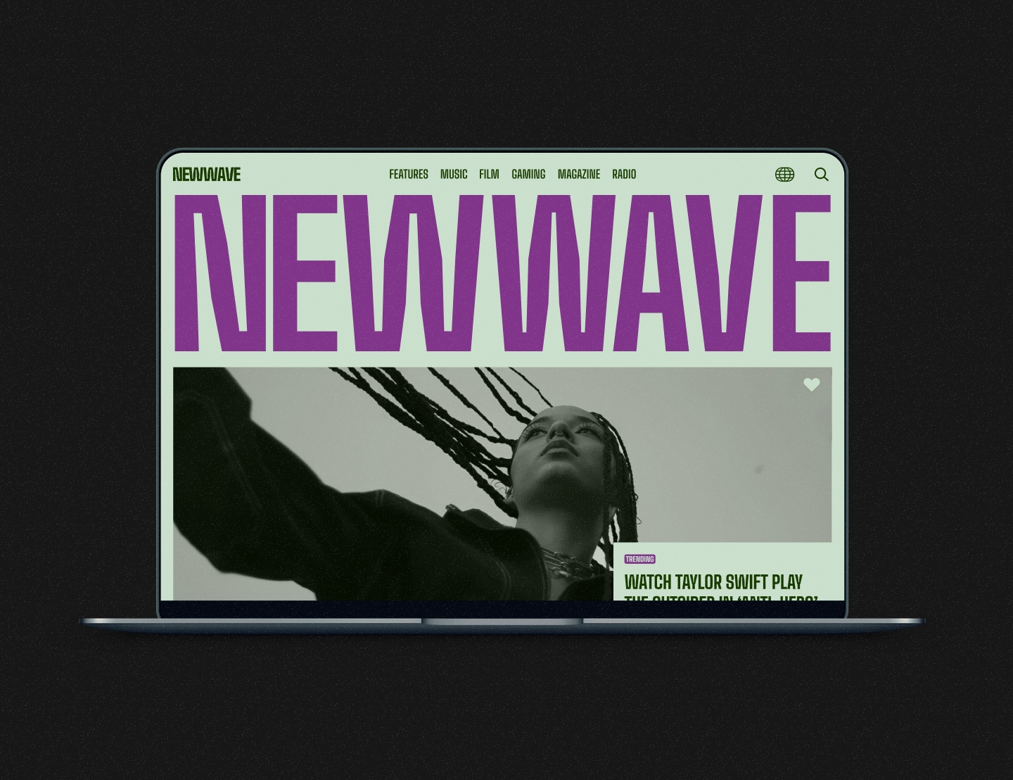
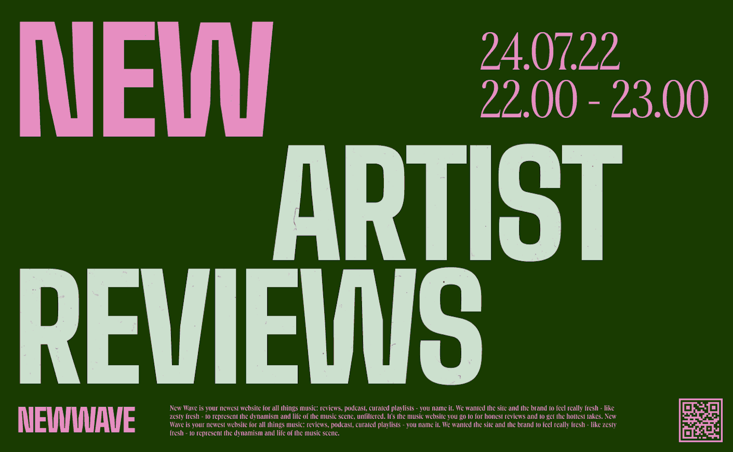
New Wave is your newest website for all things music: reviews, podcast, curated playlists - you name it. We wanted the site and the brand to feel really fresh - like zesty fresh - to represent the dynamism and life of the music scene, unfiltered. It's the music website you go to for honest reviews and to get the hottest takes.



An edge and an attitude
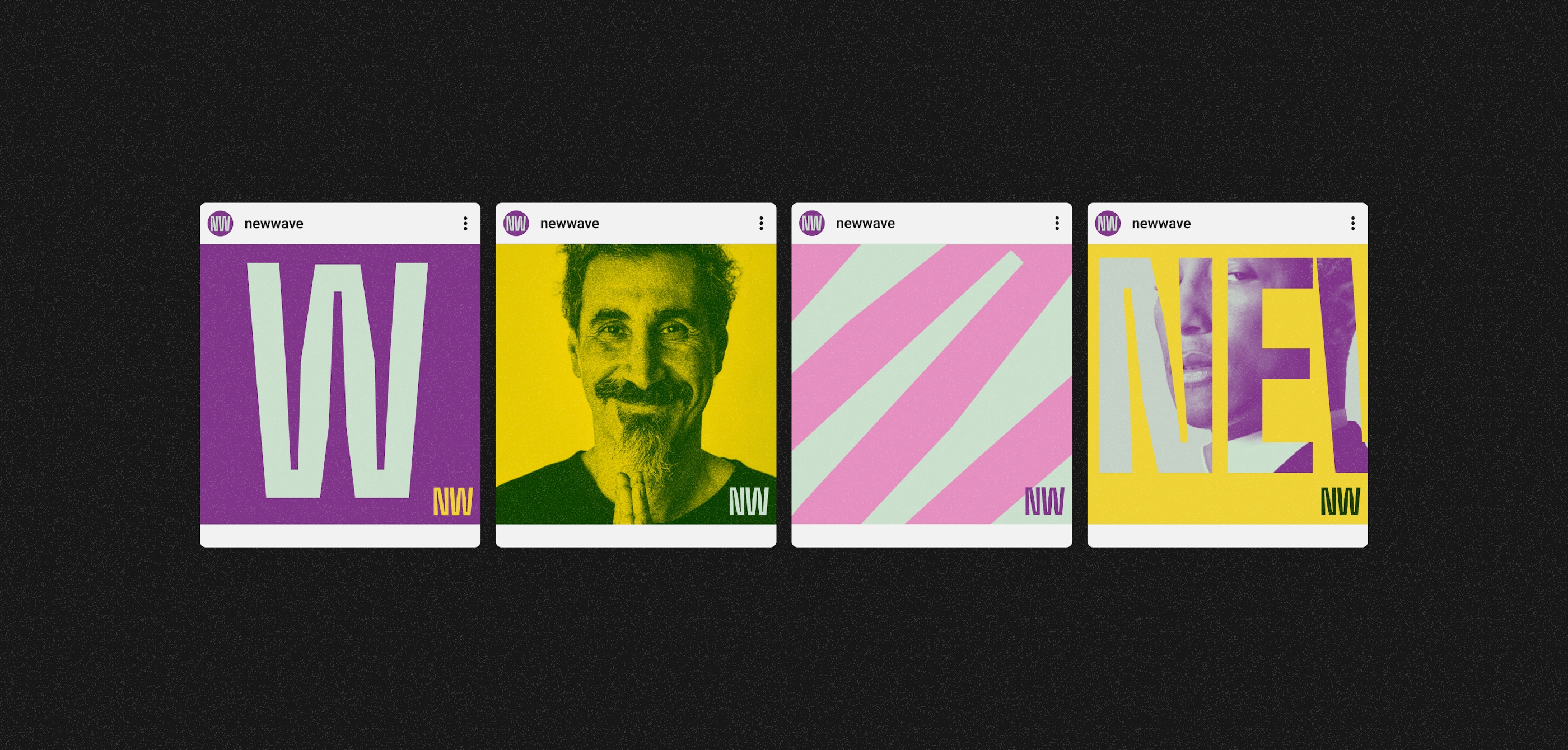
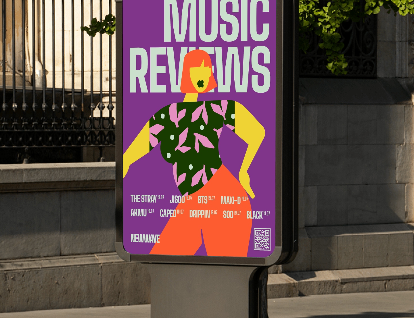
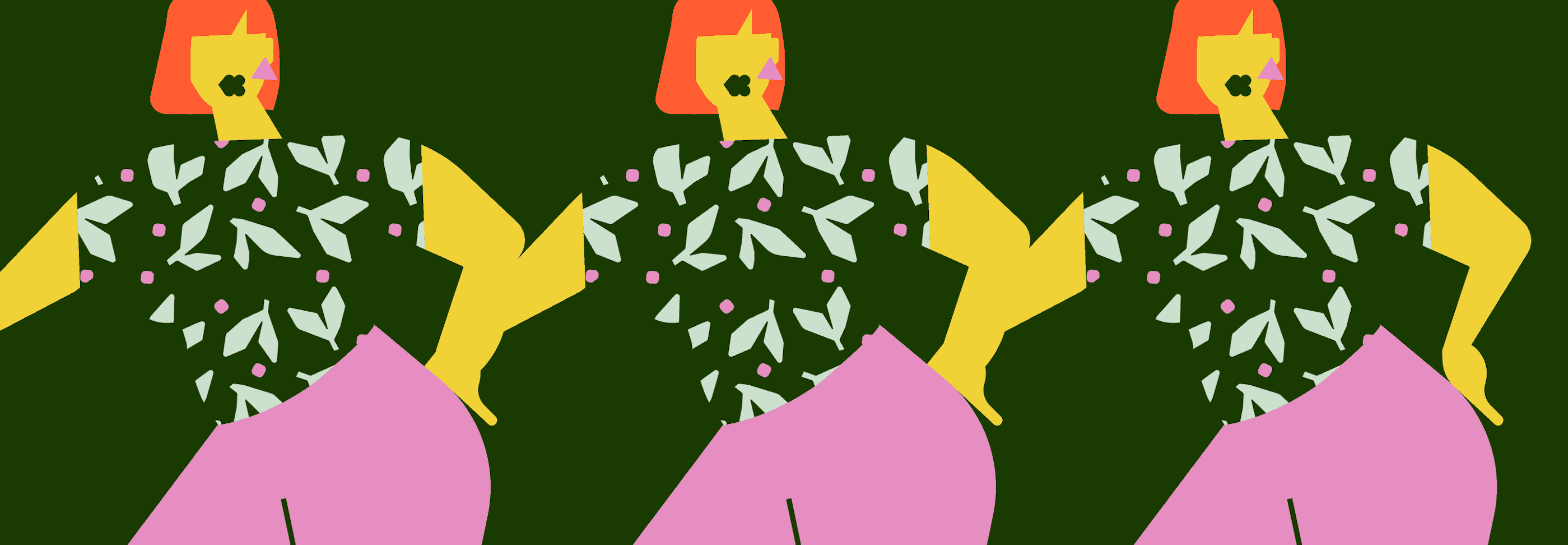
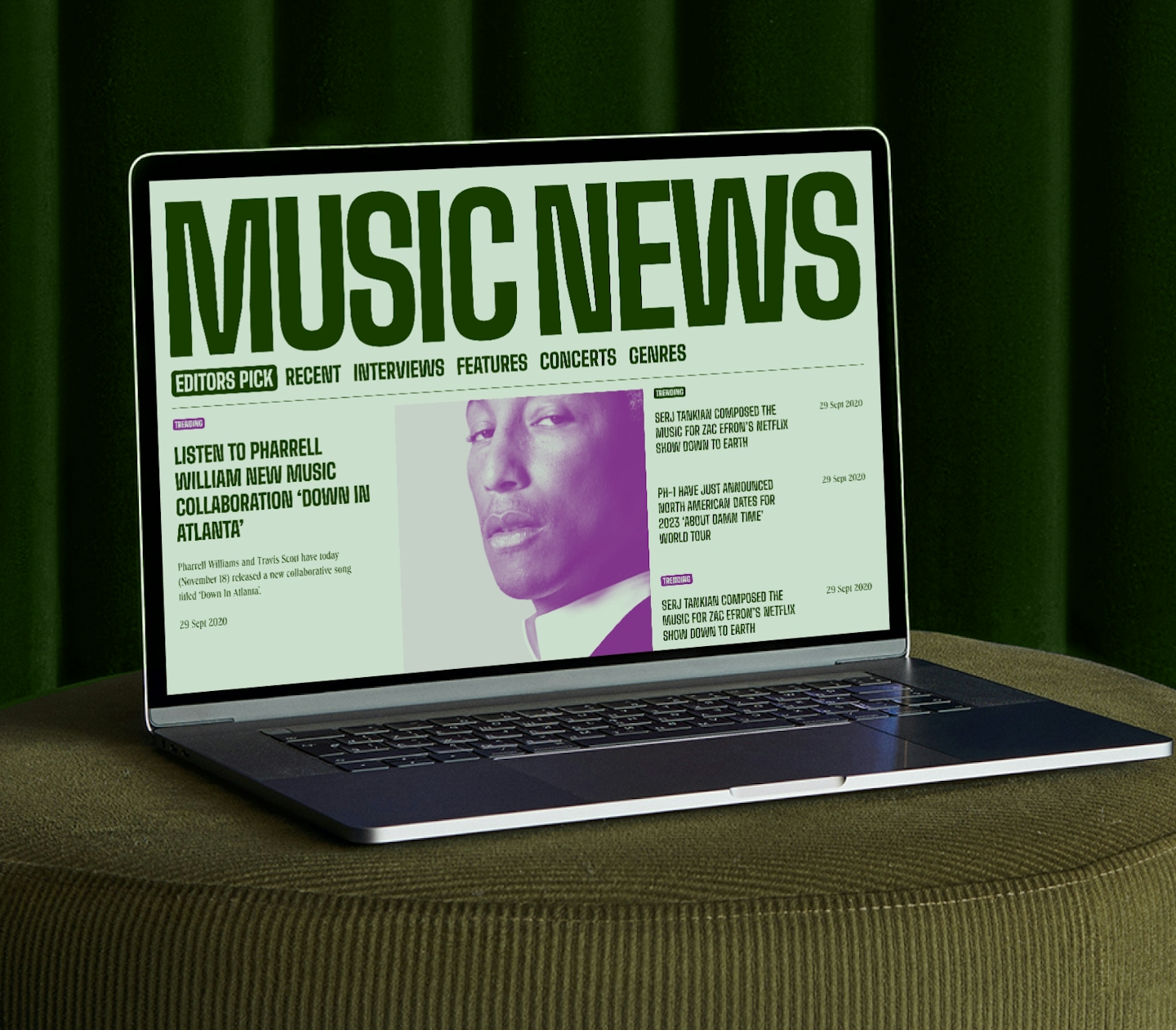
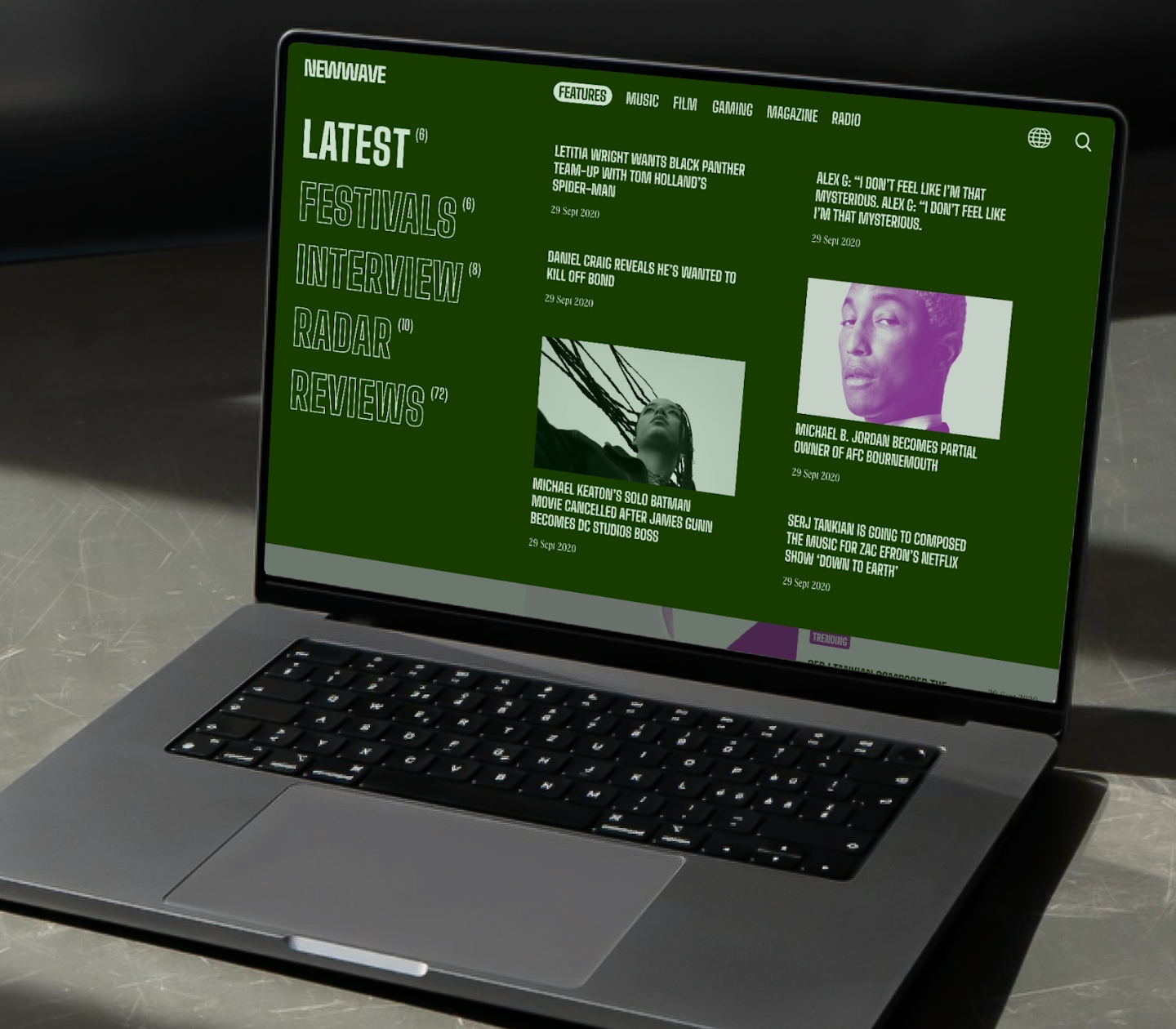
New Wave is very much an expression of music in colour. We wanted it to personify an identity that's unique to itself and has a point of view - an identity that's not afraid to be a little out there, charting new waves as it goes. It was key for us to represent that in how we've treated the photography, illustrations, and typography as a whole.

.
.
A boldie and a baddie
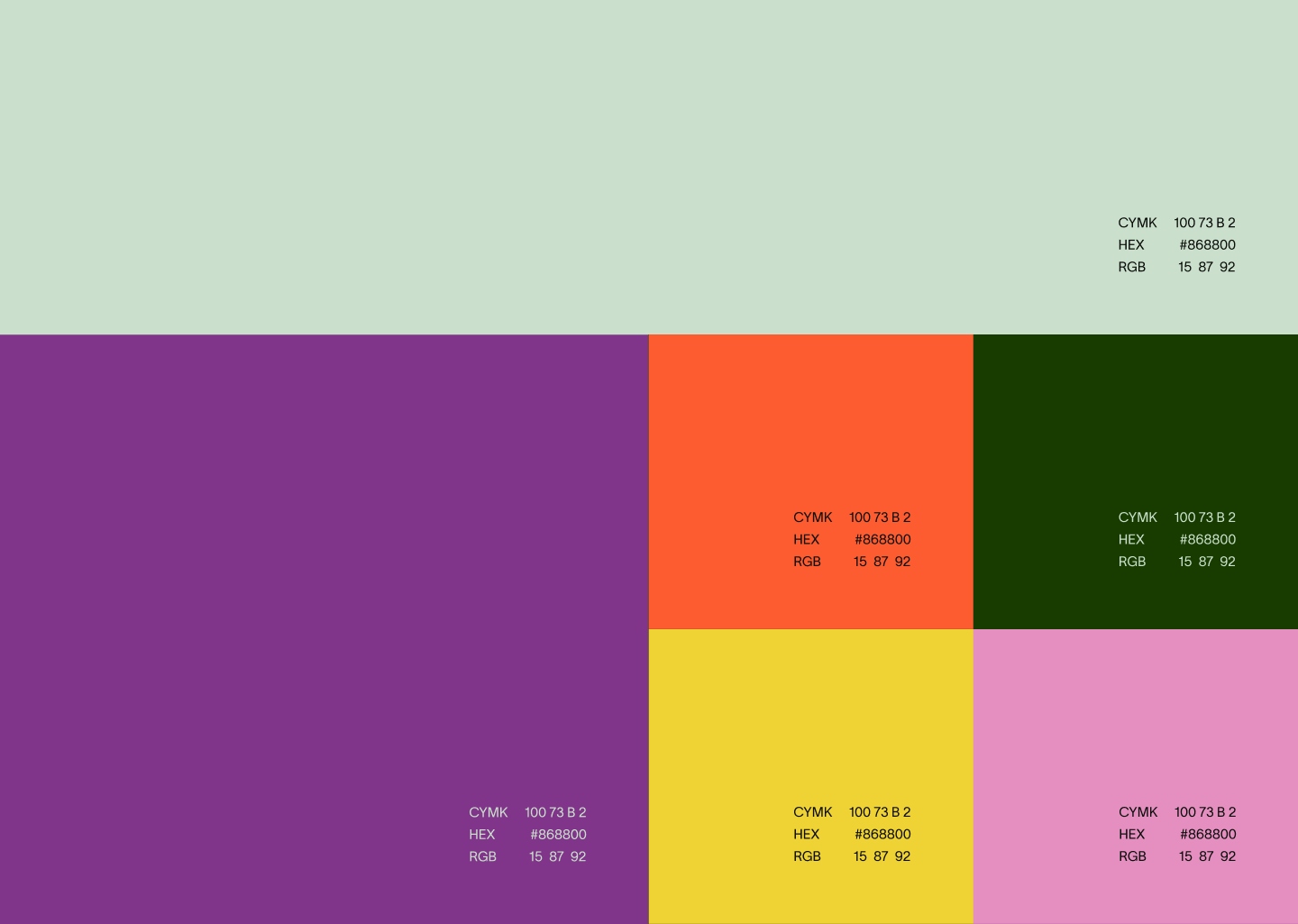
While we very much wanted New Wave to be this spunky persona, we still wanted it to maintain an air of finesse. We carefully chose the font Big Shoulders (very apt name) because it has these interesting dips and curves yet its perfectly legible still. It fits the exact line we're trying to toe. The colour scheme is made up of all the colours that, in theory, would not work. They're a bunch of misfit colours that when together, creates an interesting contrast of mellow pastels vs. vibrant hues. We loved that dichotomy and felt it was an appropriate exploration for this site.
.
.
