
Learning in the new normal
- Year2020 — 2021
- ClientMyEd
- Disciplinebrand identity, uiux, illustration
- SectorEducation


Flexible learning inspired by the pandemic
.
MyEd is an EdTech startup in partnership with Birmingham City Council with a deep passion to serve and benefit society through innovative education platforms. Our goal in this project was to marry design and function together for their Open School learning app inline with the UK education system and arising needs, post-pandemic, for remote and blended learning for schools, teachers, parents, and pupils.
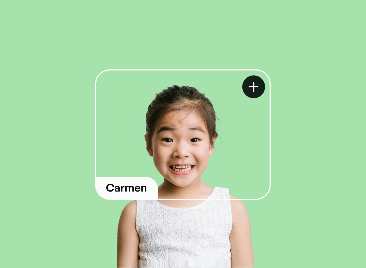
One app fit for the entire school
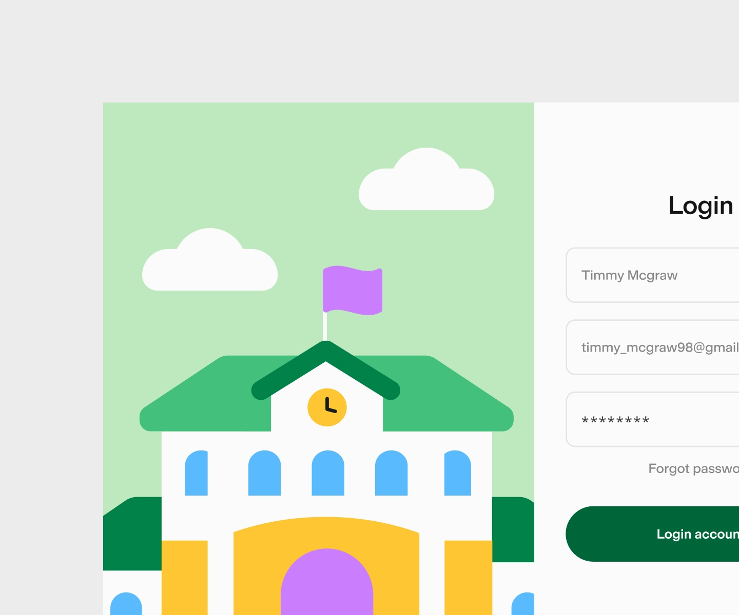
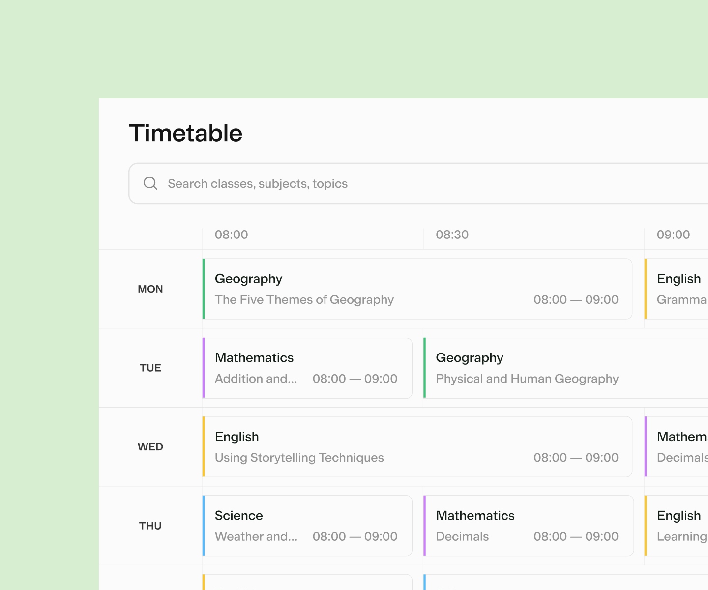
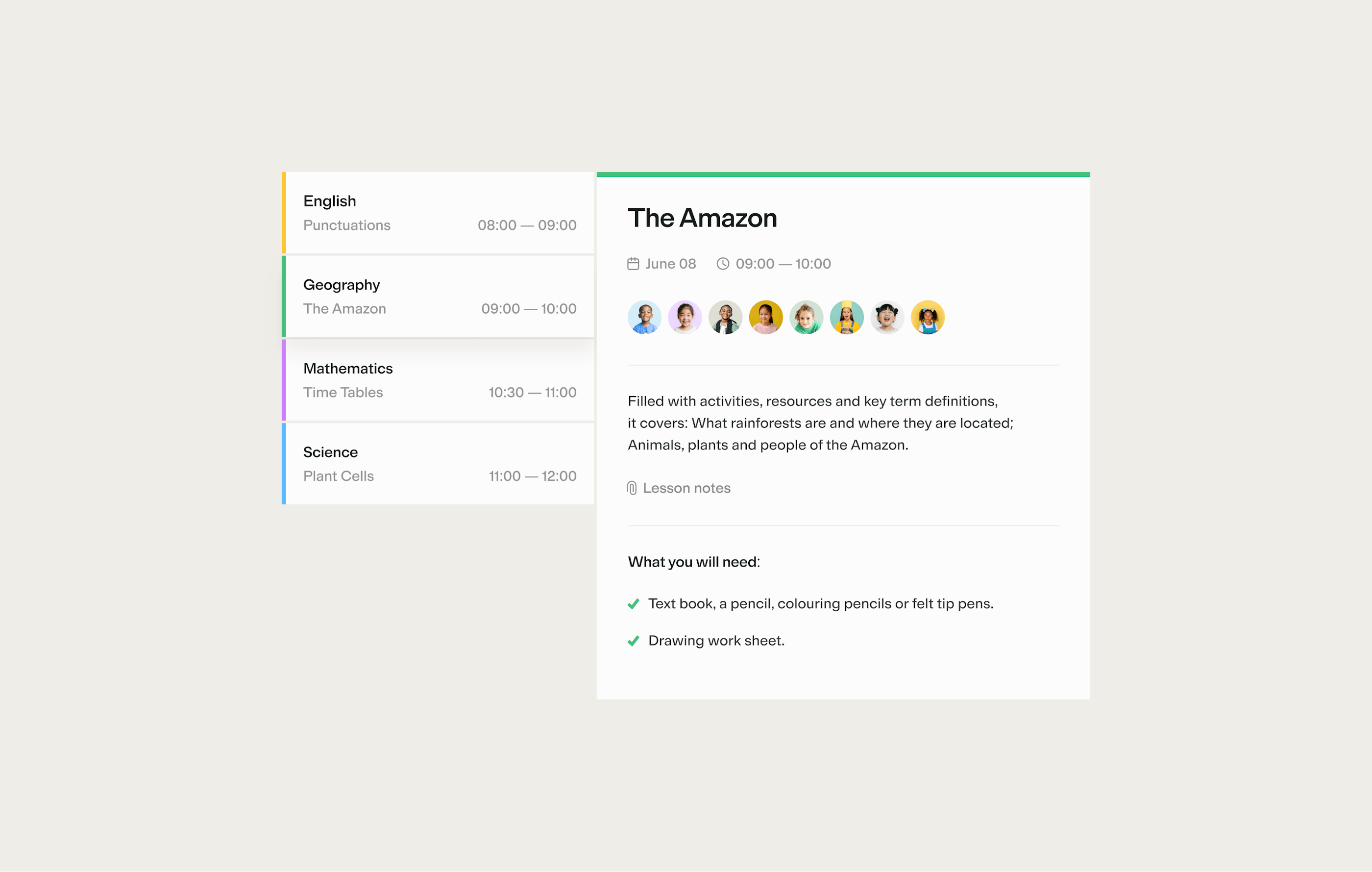
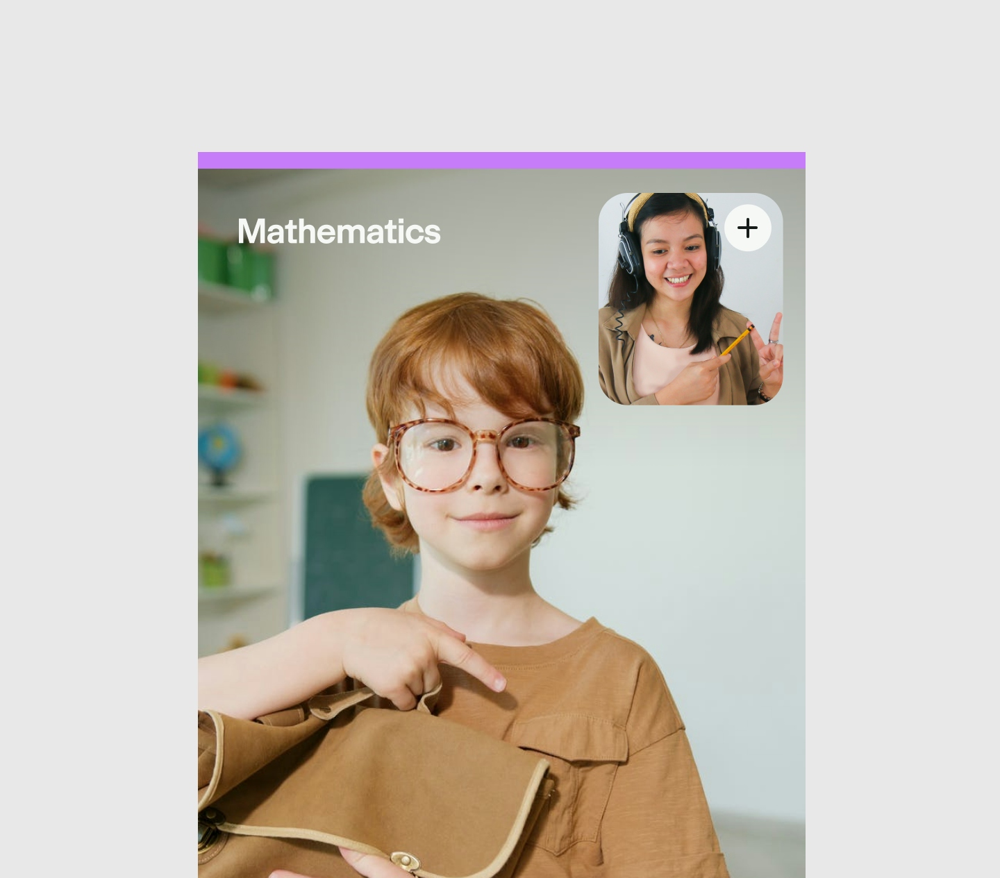
MyEd Open School is an extensive and robust app, catered to meet the needs of 3 distinct use cases: teachers, pupils, and parents. The main problem we faced was finding one sweet spot that could appeal to all three groups of people in terms of visuals and ease of use without compromising on any features. We also had to consider the vastly different learning stages of all pupils (aged 3-12) and how they best absorb information.
"
A mark of any great design team is asking the right questions before producing concepts and design outputs. Tofu has got it right! From project management, understanding the brief, conceptualisation and recommendations, design and creativity to delivery and handover - every part of the journey and process is perfectly managed and professionally executed.
Eamon Pardesi, co-founder
Finding a look & feel for all ages
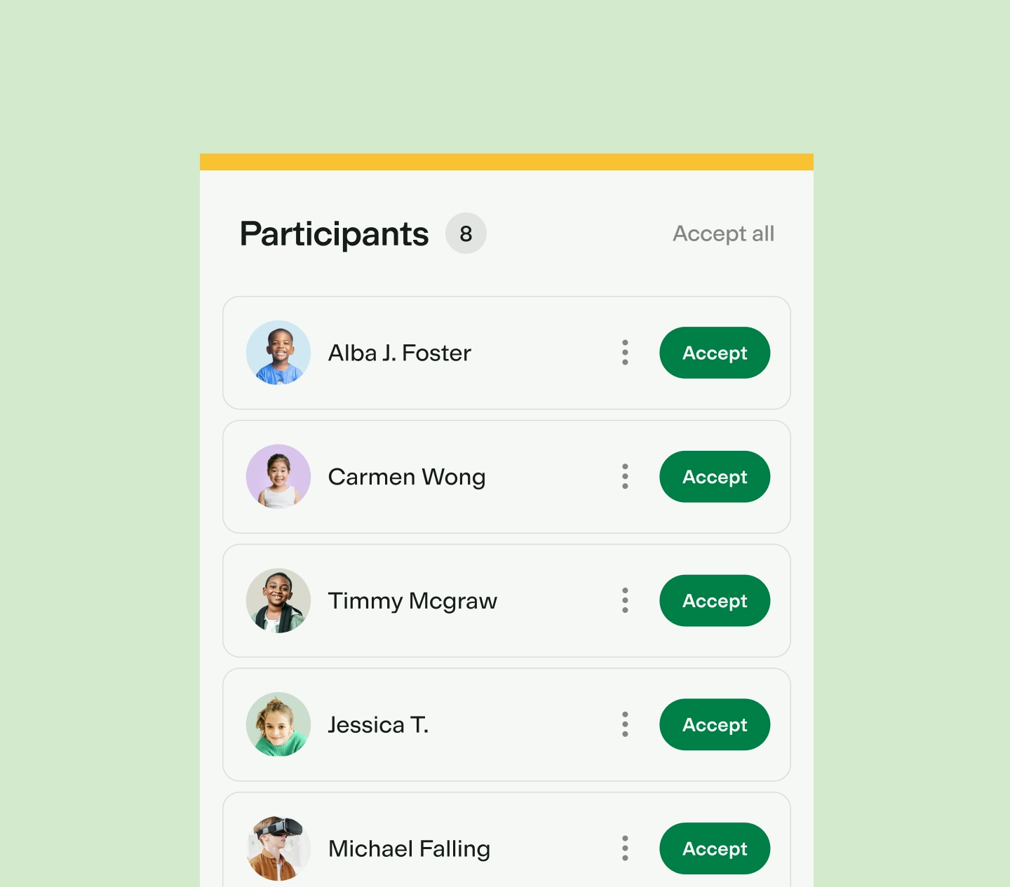
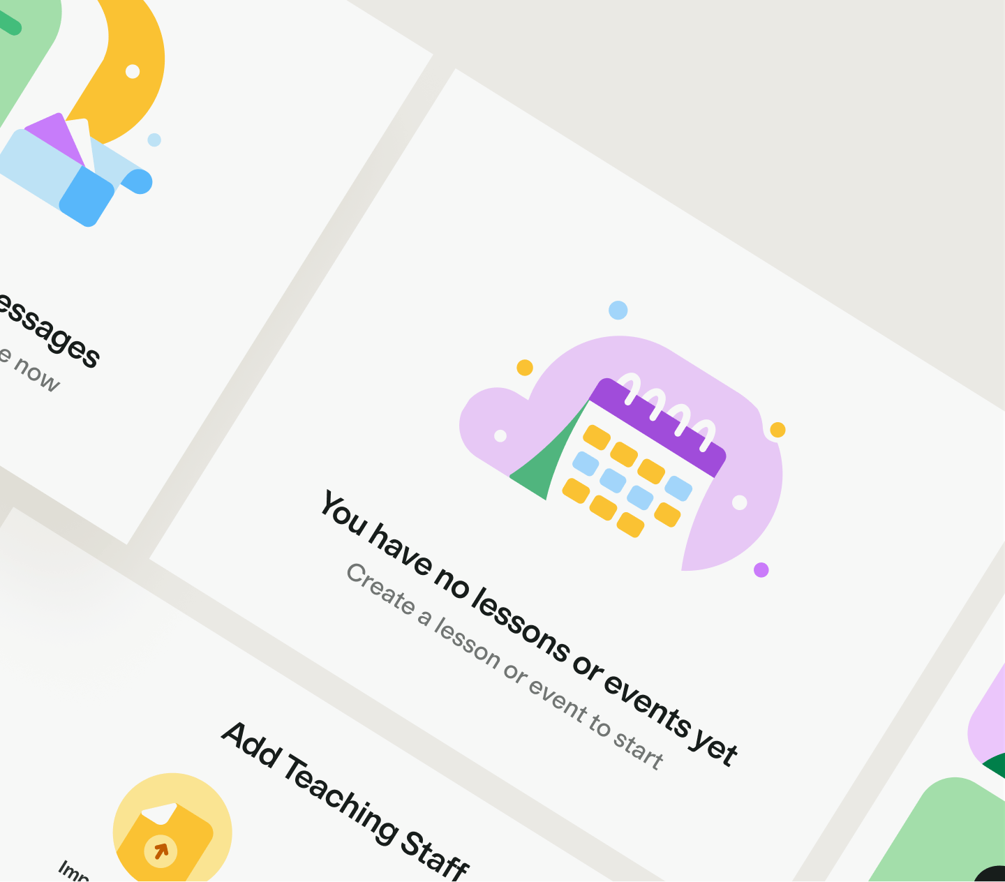
There are two things to consider in establishing the illustration style: the general illustrations and the avatar. We had to be mindful of the many age groups we're dealing with - from pupils between 3-12 to adults between 30-65 - ensuring the illustrations were friendly but not childish, carefully toeing the line so a wider audience can still appreciate it. The illustration system is made mostly of basic shapes like circles, and rounded rectangles. This is applied across the board to the characters, objects, and buildings so they all feel like they exist in the same universe.
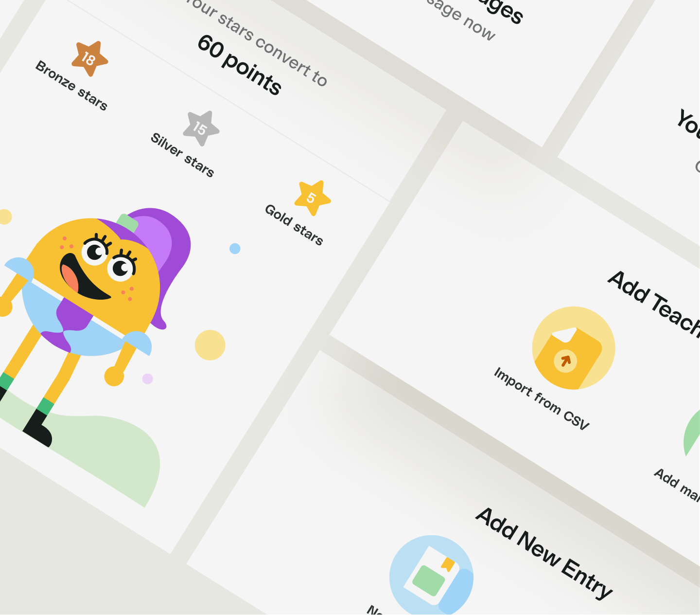
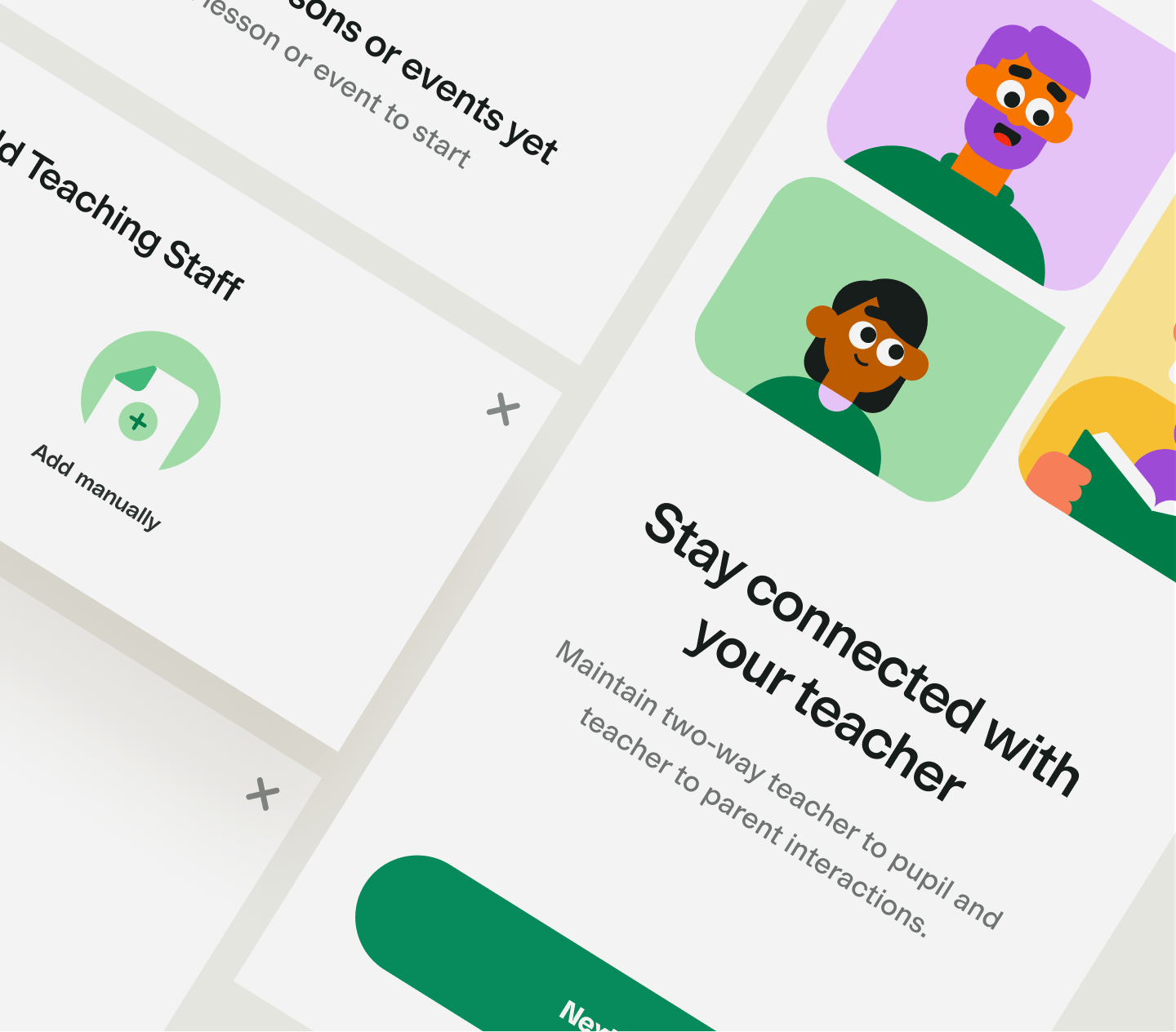
Colour & Typography
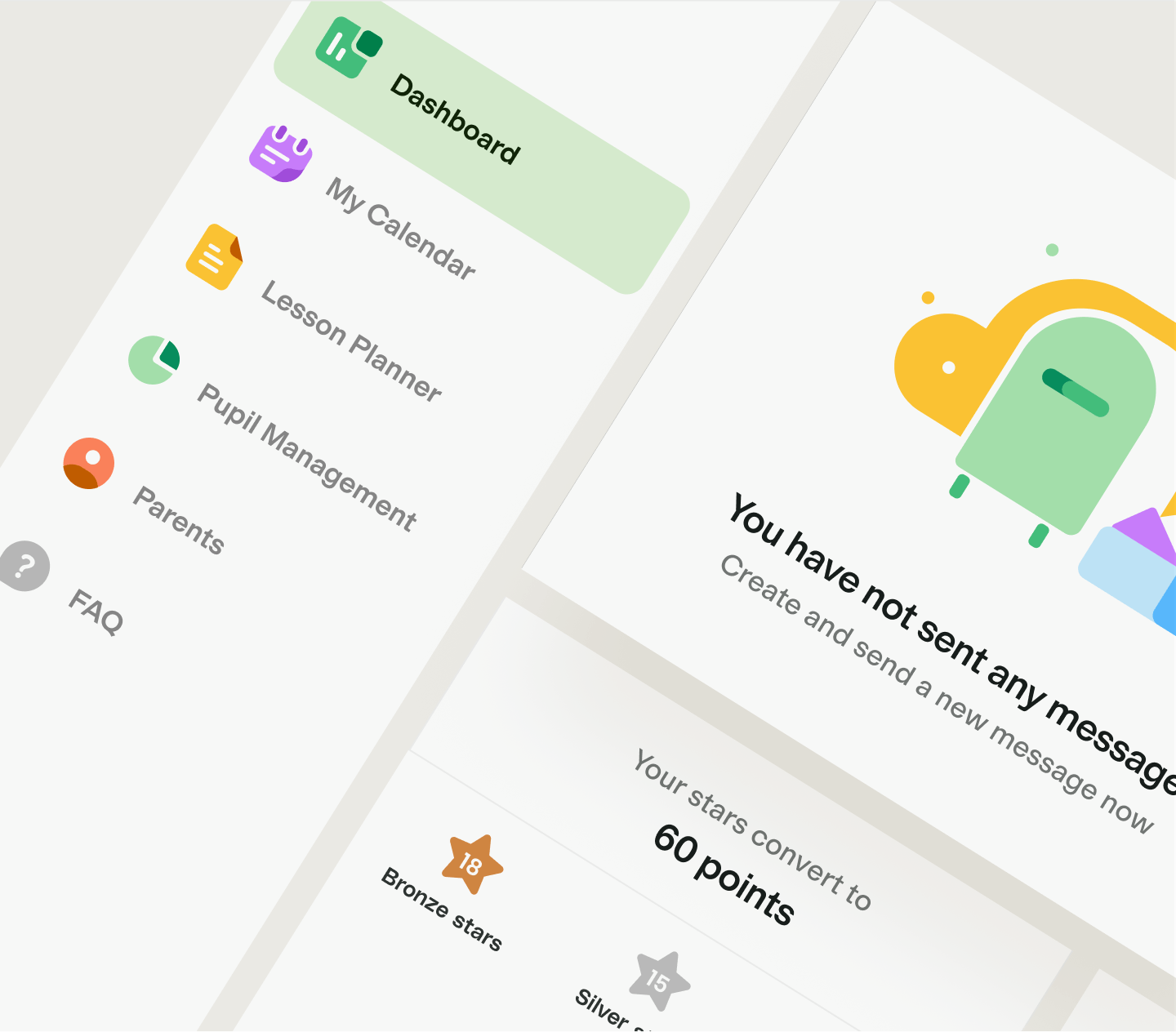
We expanded MyEd's brand identity by adding to the colour scheme - choosing colours that represented the whole MyEd universe but tweaking the hue to better match the purpose here. We wanted these colours to be vibrant and energizing, making school and learning that much more enjoyable for everyone involved. We sized up the font to roughly about 1.25x bigger than usual because we had to establish a median font size that was big enough for younger pupils to read, but not so much that it becomes disruptive for older pupils or teachers to function in it.

Making learning fun and exciting
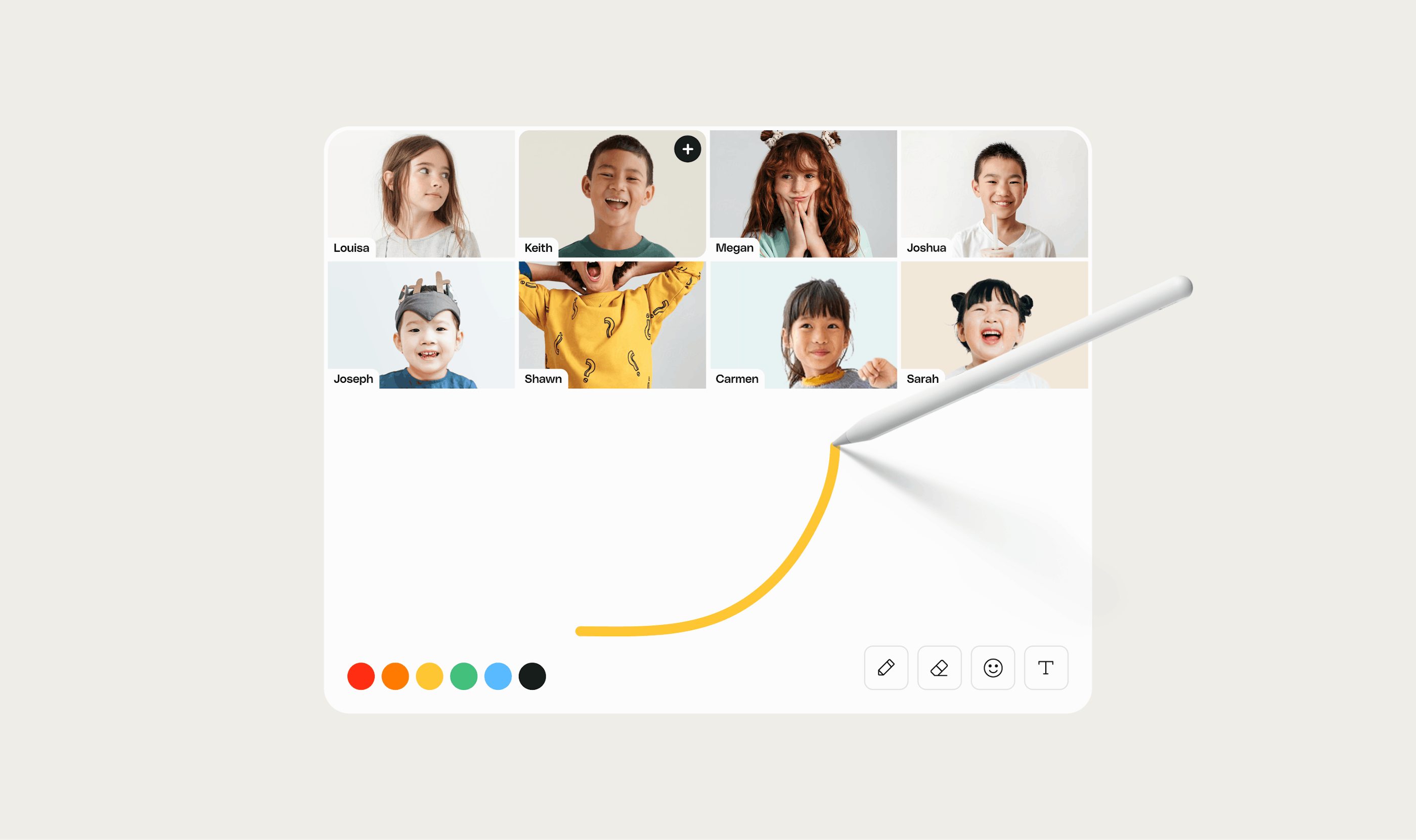
Our vision for the overall look was to convey a sense of fun and play - a welcoming environment to learn and help kids stay engaged in an otherwise unconventional setting. Interactive features like Instant Reactions, Rewards, and Avatars help to bring a certain level of gamification to spice things up and instil a goal for each pupil's lesson.

"
Tofu Design is absolutely amazing. Tofu exceeded expectations on all levels and to top it off are the nicest people to work with. We have found our long term design partners and I can not recommend Tofu enough!
Eamon Pardesi, co-founder


